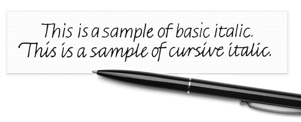
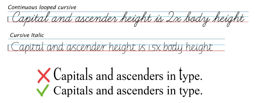
Sometimes people ask why Getty-Dubay® Italic capital and ascender height is different from that of continuous looped cursive styles.
There are three reasons: Historical, practical and aesthetic.
Historical
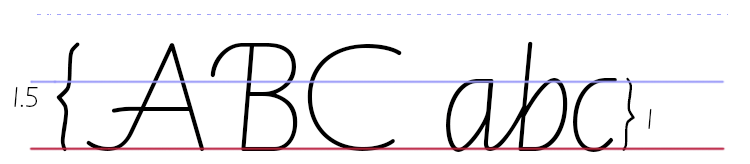
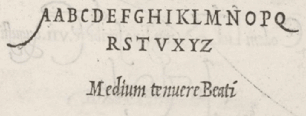
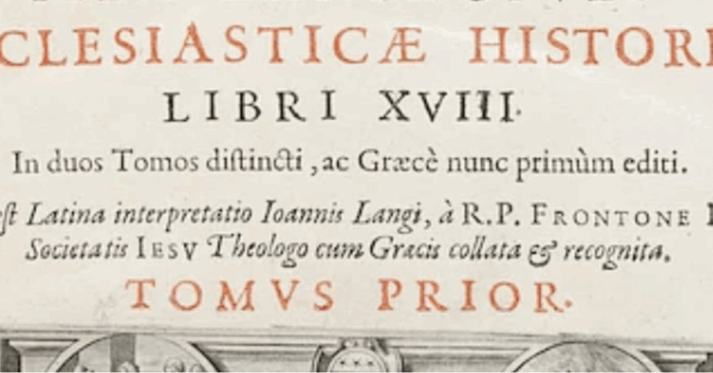
Getty-Dubay® Italic is a modern version of the Chancery style from the Italian renaissance. The first-ever printed instruction book in handwriting that we know of is Arrighi’s L’Operina from 1522. You can see in this image below that the capital height, although variable, is generally 1.5 times the height of the lowercase letters (what we call the body height). The ascender height, however, varies from 1.5 to many times the body height, depending on the amount of flourish.
Over the last 500 years, practitioners of the Italic style have offered varying views about what constitutes correct ascender height (1.5 or 2x), while mostly agreeing on the size of capitals as 1.5x the body height.
Typographers, however, have followed the model set forth by Renaissance type designers, where the Roman capitals conform to the 1.5x rule, and ascenders do the same, as in this example from 1555 of Handbook of the Christian Soldier by Desiderius Erasmus.
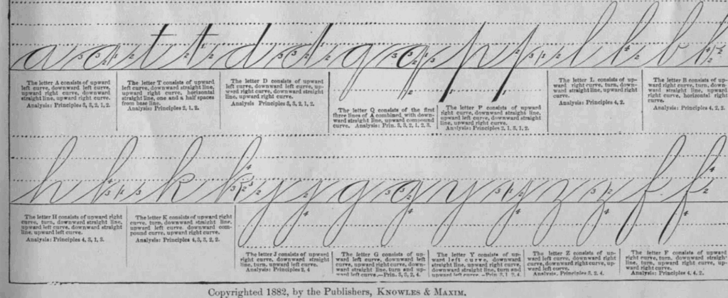
In the 19th century, in Spencerian instruction books, such as the one pictured here, from 1881, we begin to see ruled lines and other directives. In this example, the ruled lines indicate a 3x ascender height for some letters, a 2x ascender on ‘p’, and capital letters as much as four times the body height.
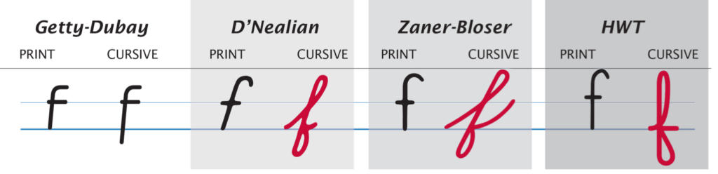
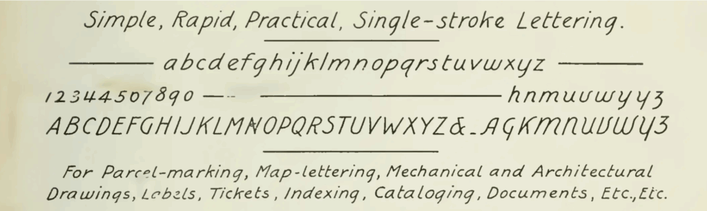
Meanwhile, lettering styles took their cue from typography. You can see in this lettering exemplar by Zaner & Bloser (1904) that the recommended capital and ascender height are similar to type.
Practical
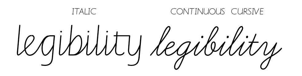
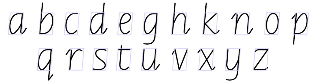
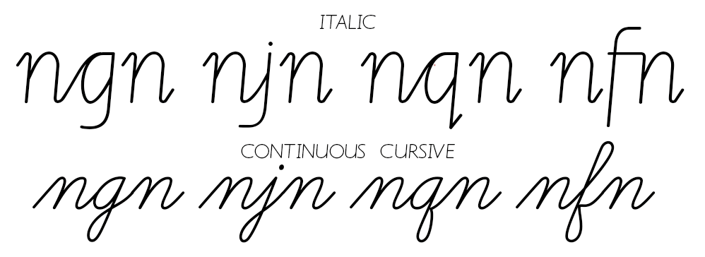
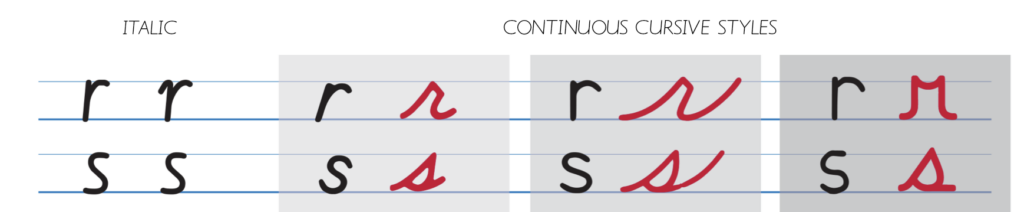
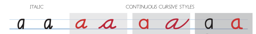
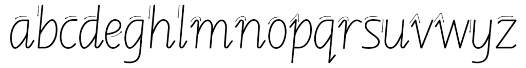
One of the goals of Getty-Dubay® Italic is legibility. Legibility is accomplished by avoiding loops, and using letterforms that are generally similar to those of type. This graphic shows how long ascenders and tall capitals typically do not occur in type. Why not? Because we read form the tops of letters. If the ascenders take too much visual attention away from the body of the letter, it slows our reading speed. Loops also interfere.
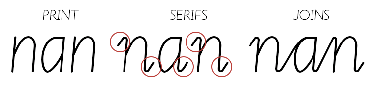
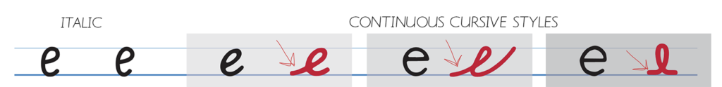
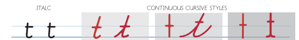
What about the ‘t’? Isn’t that an ascender, too? Actually, it isn’t. Historically, ‘t’ originated from the Roman capital ‘T’. Look at the typeface above and you’ll see that the top of the ‘t’ extends only a little bit above the waistline. If it extends too high, it could be confused with other similar letters (such as ‘f’ or ‘l’).
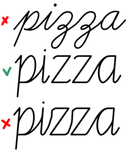
Another reason: People tend to exaggerate the size and shape of ascenders and descenders when writing quickly or expressively. Sometimes this can result in the body of letter — the part that contains the most important information — becoming a tiny boat on a sea of loops and curlicues.
Another unwanted result of exaggerated ascenders and descenders is that a line of writing is more likely to run into and obscure the next line with tangled loops and capitals (on the right-hand side of the image.)
Aesthetic
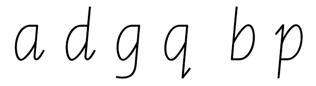
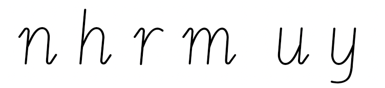
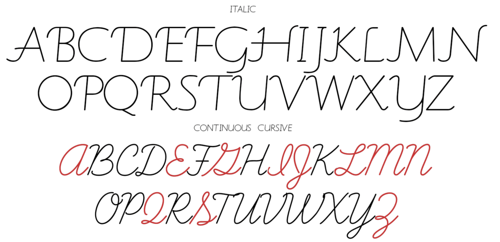
One of the hallmarks of the Italic style is the beauty of the letterforms. Most of the lowercase letters in the Italic style share the golden ratio (1.618…) with each other. For example, the width of the ‘a’ multiplied by the golden ratio equals its height. The same goes for every letter except ‘i’, ‘j’, ‘l’, ‘m’, and ‘w’. Long ascenders and descenders can over-balance the body of the letter, looking awkward or excessive.
You are certainly welcome to make your handwriting personal, expressive, and unique. But do remember that when you want someone else to be able to read your handwriting, you need to give them enough to go on — such as clear and uncluttered tops of letters — and not too many distractions.